Alphabet Pages
In this lock down medical emergency, I embarked on a massive project (although what of my projects are not massive) to make pages of all the alphabets I know. As I began to look at all the alphabets I had samples for in my file cabinet, I realized that I knew quite a few. This was daunting and exciting all at the same time and I knew it was a project that would take me through the coronavirus pandemic as well as into the next year (or two).
I was hoping to have all the pages conform to the same dimensions, so I could bind them all up into a large book once they were all finished. To that end I needed to look at the alphabets that were majuscle, minuscle or both and see what size paper would accommodate them all.
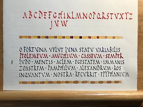
These were the two fonts (above) I looked at, as the roman rustic was a majuscle alphabet and the black letter was both upper and lower case. In the end I settled on sheets of paper that were 16 x 16 in with one inch on the left side for binding. I wanted different types of paper for these various alphabets, so I ordered sheets of BFK Reeves (white & cream), Arches 90lb hot press watercolor paper (I already had 90lb cold press), and Stonehenge (white & cream). I also had sheets of Japanese paper in my studio, but I wasn’t sure if I wanted to use that. I still might. The different papers would give the book an artist book feel and would allow me to used different media (ink, watercolor, gouche, acrylic) for the page designs. Once I had the size down, I looked at what nibs would work for the different papers. I typically use either Brause or Leonardt for finish work with Speedball being used for practice. For the heavier papers (Stonehenge, Arches 140lb) the Brause nibs work well. For the lighter papers (BFK Reeves) the Leonardt nibs are suitable.
These letters (left) were done on Arches Text Wove (a lighter paper) which I had laying around the studio and it looked like all the nibs worked well.
I knew that I would have more than just lettering on these pages and the first thing that came to mind was borders. I looked at several types of borders. Borders that I had used in the past, line endings, and images that I have acquired from various buildings in Istanbul, London, Venice, Florence, Athens, Ephesus, Dublin, and Edinburgh.
I used the various pages that had been lettered to determine page size, to experiment with the different border designs.
The more I thought about it, the more I realized that I was going to want more than just borders. I would need art work to play with also. In the end it came down to what borders designs and art would best match the alphabet. All the alphabets I do are linked in time to the art and designs from the period in which the alphabets were used. Not only art within the books in which the lettering is found, but to art found in frescoes, murals and mosaics of the time. For the early alphabets I used Roman and Celtic art and designs found on excavated walls and floors. For alphabets in the Renaissance period, art can be found in manuscripts, cathedrals and secular architecture. The more modern alphabets would require designs from other media, such as printmaking.


